


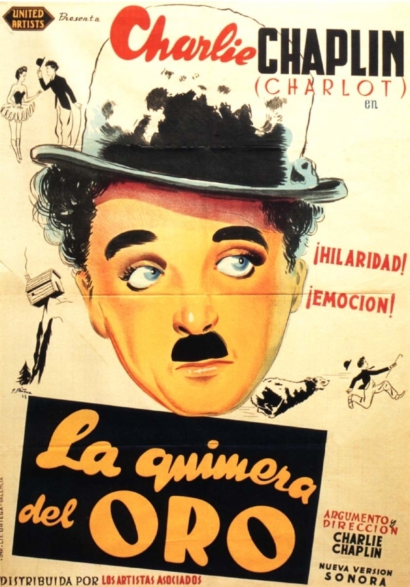


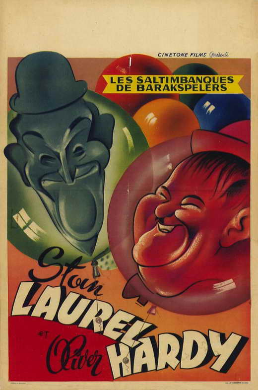


Garish, bright, loud, the posters usually involve illustrations of the stars pulling some ridiculous face or humorous action. They are simple, not technical, and perfectly capture the silly, over-the-top atmosphere of slapstick films.
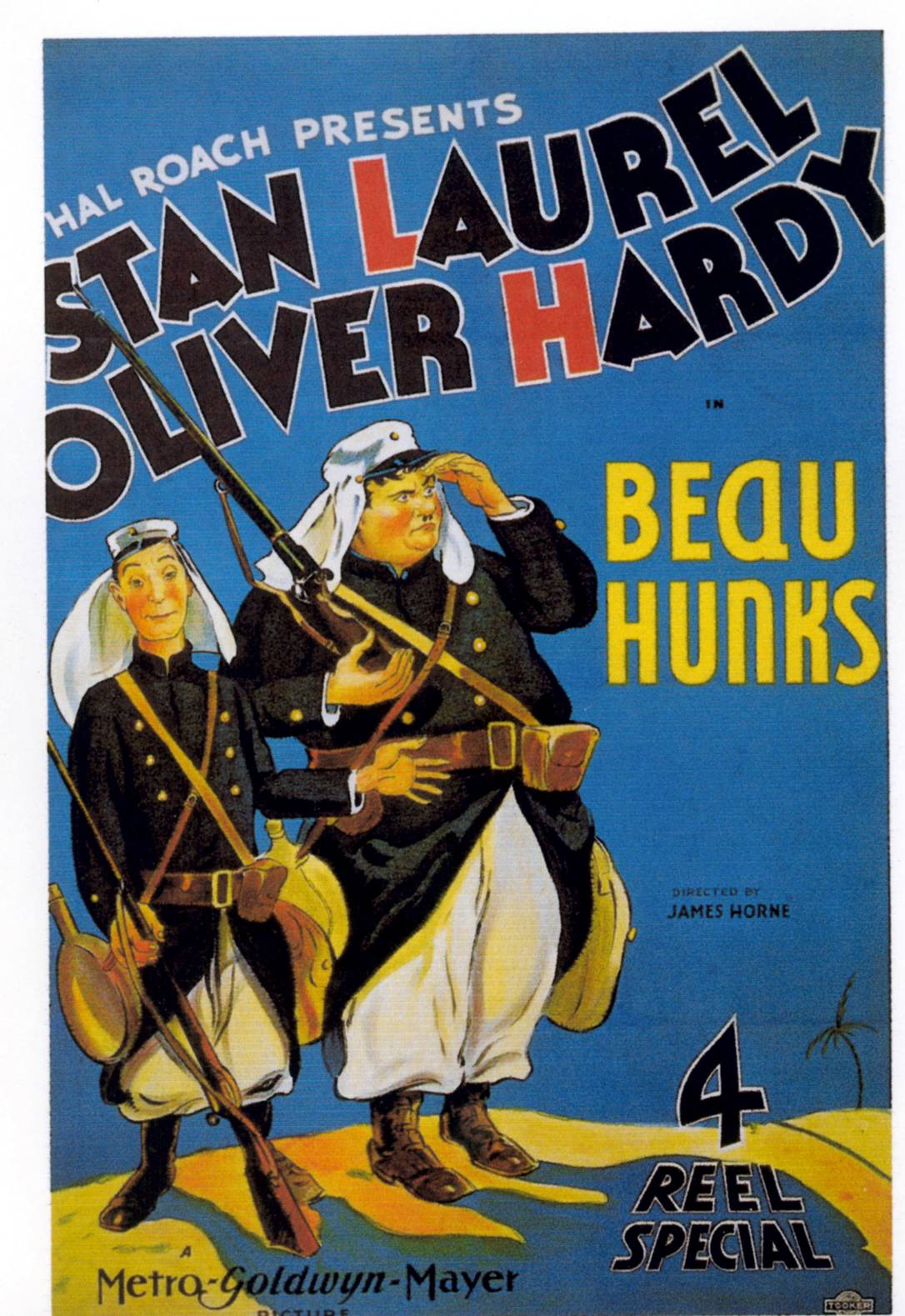
Don't really get anything more from the use of red in the title here, as Laurel and Hardy are memorable by name, not initial. This could be a technique that I could employ in my poster, perhaps linking actor/producor/director's names with the title?

I'm not particularly fond of the illustrations on this poster, or of the jaunty type that screams at you from the centre. However, having watched clips of Laurel and Hardy films, this loud, fun, over-the-top and gaudy atmosphere is exactly the kind of feeling that their ridiculous behaviour creates in the films.


Another Chaplin classic. Really like the use of title inserts in this one, breaks up the action a bit and gives it a humorous tone. In the more classic examples of slapstick such as this, the dialogue is either very limited or non-existent, and I feel that these titles help to tell a bit of the story, without interrupting what should be fast-paced, funny action.
Low-tech, mostly long/medium shots (showing all of the action), fast motion (+ shaky camera), B+W
Slapstick is about the action within the frame, more than the way that frame is shot. It is about simplicity, not gimmicks, and the shots used are purely functional, as opposed to being used to create tension in a scene. The camera placement is purely chosen to make the action taking place within easier to see, and laugh at!
Subscribe to:
Posts (Atom)


- Follow Us on Twitter!
- "Join Us on Facebook!
- RSS
Contact