Tuesday 11 December 2012 0 comments

Packaging Links/Ideas

Interesting cd packaging design


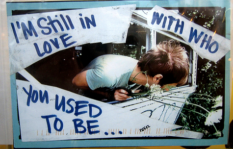
I love this idea of taking images and altering them, to give them either more or a different meaning. I think this technique could be an effective way to capture the irony of 'Yeah! Oh Yeah' in relation to love and the expectations that come with that kind of relationship. The song depicts the breakdown of a relationship, but the tone, pace and overall sound do not capture the hurt that I would expect of this type of breakdown. It is as if their relationship has broken down and they are almost happy to watch it crumble, the 'Yeah! Oh Yeah' that is repeated throughout seems to me an admission of the breakdown, without the usual desire to stop it or try to save the relationship. This makes the song, in my eyes, a kind of 'anti-love song' - it appears nonchalant about such a sad occurrence as the break-up of a marriage and  the threat of 'killing your wife'. To capture this irony, I thought about using found images of iconic lovers, perhaps doomed ones, who encapsulate the passion and hurt that would be expected in this situation, and deconstructing them in a similar way to these pieces - letting the lyrics of the song eat away at true, enduring love, as the narrators of the song have let problems eat away at their love.


Taking the title of the album literally, and having a bit of fun with it. I like the idea of interactivity - something for the consumer to do as opposed to just opening a simple jewel case and being done with it.


I really loved this one... It completely confused me when I first opened the box, I assumed my friend had lent me the wrong disc - a pirate copy. After putting the DVD in and finding that it was legitimate, I thought about it for a while and finally caught on that the disc is supposed to represent the disc in the story, on which Salander records the rape. I like design that doesn't treat the consumer like an idiot (although at first I was!), that assumes some intelligence or that relies on some prior knowledge of the subject in order to 'get it', I think this makes the consumer feel more involved with what they are purchasing than they ever could be if they were simply downloading the file from the web.


A 'rough' guide, I see what they did there! A lot of the best examples are things that click straight away, give the consumer some wit (for a change) and make the product look interesting, really really simply.



Saturday 8 December 2012 0 comments

Silvia Pelissero (Agnes Cecile)

I want to do this!
Friday 7 December 2012 0 comments

Well, it's not the Cure, but it could have been worse, I suppose :/


Monday 19 November 2012 0 comments

Countdown of a rocket launch

Tuesday 13 November 2012 0 comments

Infographics


Saturday 3 November 2012 0 comments

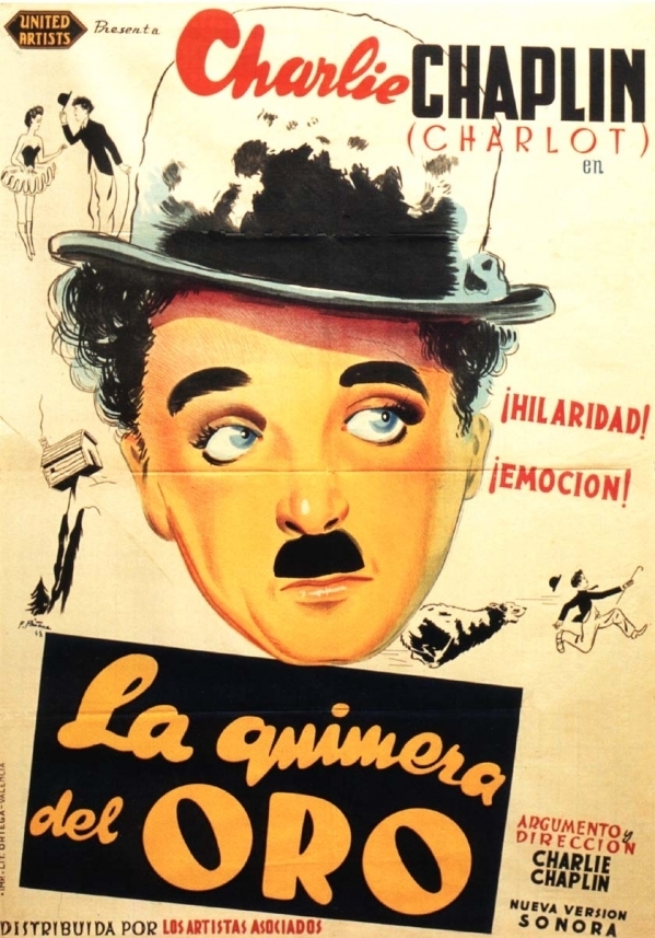
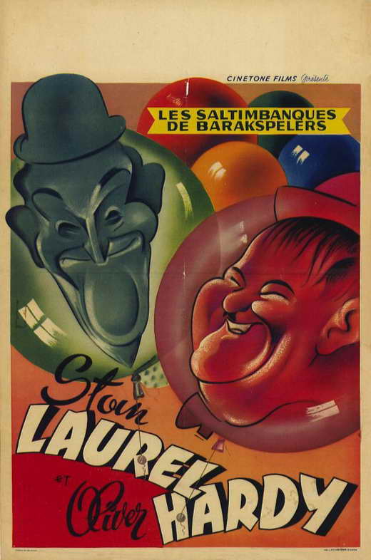
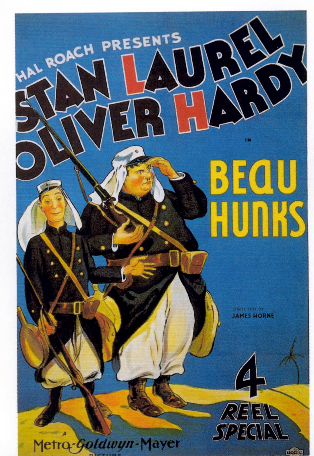
Slapstick Movie posters


Modern_Times_poster.jpg


Garish, bright, loud, the posters usually involve illustrations of the stars pulling some ridiculous face or humorous action. They are simple, not technical, and perfectly capture the silly, over-the-top atmosphere of slapstick films.


Don't really get anything more from the use of red in the title here, as Laurel and Hardy are memorable by name, not initial. This could be a technique that I could employ in my poster, perhaps linking actor/producor/director's names with the title?


I'm not particularly fond of the illustrations on this poster, or of the jaunty type that screams at you from the centre. However, having watched clips of Laurel and Hardy films, this loud, fun, over-the-top and gaudy atmosphere is exactly the kind of feeling that their ridiculous behaviour creates in the films. 


Monday 29 October 2012 0 comments

Slapstick soundtracks

http://www.loudtronix.me/search/Slapstick-Soundtracks
0 comments

Jerry Lewis and Dean Martin

When I hear slapstick, I instantly think Jerry Lewis (and/or Dean Martin). Lewis' facial expressions are unrivaled, in my opinion, and I love Martin's ability to remain utterly serious in the face of such ridiculousness. This is something that I have noticed in much of the slapstick I've watched - that insanity can unfold, but the victim of the 'violence' reacts in a very understated manner.
0 comments

Titles/narrative in slapstick

 
 Another Chaplin classic. Really like the use of title inserts in this one, breaks up the action a bit and gives it a humorous tone. In the more classic examples of slapstick such as this, the dialogue is either very limited or non-existent, and I feel that these titles help to tell a bit of the story, without interrupting what should be fast-paced, funny action.

Sunday 28 October 2012 0 comments

Slapstick - Charlie Chaplin


Low-tech, mostly long/medium shots (showing all of the action), fast motion (+ shaky camera), B+W
Slapstick is about the action within the frame, more than the way that frame is shot. It is about simplicity, not gimmicks, and the shots used are purely functional, as opposed to being used to create tension in a scene. The camera placement is purely chosen to make the action taking place within easier to see, and laugh at!

Saturday 13 October 2012 0 comments

Bernard MT Condensed... Well, sort of...


Monday 8 October 2012 0 comments

1960s Moodboard


Sunday 7 October 2012 0 comments

Narrowing it down.


Okay, I've narrowed it down to what I think encapsulates the 60s for me: the mods and the early skinheads.

I know that I want to capture the female sides of these subcultures, because they were centred mostly around males at the time (ie gangs, rivalry) and I want to try to capture the underside, the reality and the way the styles applied to the female body. I like the fact that there was a female side to one of the 'hardest' youth subcultures of the day, the skinheads. It was about music, the working class and a simple life - something which couldn't be further from the mod culture, which was very much about consumerism and the latest fashions. Both are instantly recogniseable styles, but they allowed for individuals to express themselves.


Mods:


Skinheads:


The female body in the 1960s:


"The 1920s and 1960s both bucked the trend of the curvaceous woman. Anthropologist Ann Bolin says that “during periods of liberation, like the 1920s, when women had just gotten the vote, and the 1960s, when the Pill became available, the ideal shape for women de-emphasized their reproductive characteristics–the nourishing breasts, the wide, childbearing hips.”


;